
Duration: 4 weeks
My role:Interaction designer, Unity developer, 3D modeling
Keywords: ManoMotion, Mixed Reality, Hand Tracking
Previously on Mixxy
In the previous part, my team and I proposed a future clubbing service — Mixxy. (Details)
After a long time shut down of in-person activities, many young people long for dancing with friends like before in clubs. We proposed a concept-Mixxy that helps those groups of people safely have the experience of dancing, drinking, and socializing with people in a mixed reality environment. To differentiate the in-person experience, we used several sensors, simulators to provide a unique club atmosphere. Most importantly, visual enhancement like synchronization of our smart glass and fancy digital cocktails, more advanced visual effect when people get high, is the key to the immersive experience.
The purpose of this project
However, I’m curious about the detailed user experience, especially how they interact with digital objects in space, even we have already sketched out the picture of this upcoming future scenario. That’s the reason why I want to continue a little bit of this project to explore the way of interaction in Mixed reality.
Design Scope
Looking back to the process of designing Mixxy experience, the drinking experience which is narrowed down by DSM from the whole journey of club experience, not only contains the socializing function (people to people) but also has a bunch of meaningful and normal interactions that people have experienced in the real club environment, which is ordering drinks.
Normally, people will go to the bar and order drinks from a bartender, based on the content in the bar menu. So, how should this process look like in Mixxy, in other words:
— How should the user interact with the system to order drinks in mixed reality?
Opening menu with one hand gesture:
Touching digital objects to trigger interactions
Design Process
I will use some of the insights from previous user research as my design constraints and base, combining case studies of current popular solutions, and then iterate the design pieces through the usability test.
Understanding trends — Ideation + Rapid prototype — Design experiment
Understanding Trends
1.1 Secondary research:
In 2020, the Hand tracking system on Oculus Quest ignited developers and designers. More and more applications enable hand input in VR recently, as Oculus said “It delivers a new sense of presence, enhances social engagement, and delivers more natural interactions with fully tracked hands and articulated fingers”. So I focus on in-air hand input for the club project.
In the study of comparing 3D user interaction published in 2020 IEEE Conference of VR, Hyo Jeong Kang observed how novice MR users responded to each interaction when there was no instruction. The result of which can help designers to identify a gesture that would render more natural interactions than existing techniques.
Among 21 testers (some are VR-ready people, some are not), they found:
1. When selecting something, *100% of participants prefer to press the button with an index finger, 82% would with the entire hand,* but only 5% would use Pinch or air-tab gesture.
2. A good example of applying affordance and provide visual guidance is the bounding box in Hololens2, which can inform the user that the object is currently adjustable and *respond to the user’s finger’s proximity.*
By doing usability tests among 10 young people during 2017–2018( half had the experience of AR/VR/3D, half didn’t), Hong An Pham found the difficulties users frequently meet during the interaction with the 3D object in the VR system by in-air hand gestures are *missing touch sense, limited hand gesture types and an object was obscured by another.* And the related suggestive improvements are *feedback system, recovery ability, simplify the task flow, and combining gestures*.
THE CHALLENGE OF HAND GESTURE INTERACTION IN THE VIRTUAL REALITY ENVIRONMENT
Papers help me uncover some general findings, but I need to learn more about how those leading technologies for customers do to improve user experience.
Case Study
At the end of 2020, I experienced WebXR and successfully published my first webVR game. During that time, I continuously browsed the interaction trends and cutting-edge products on Twitter, Youtube and had tried on my own Oculus quest device if possible. Here are some personal thoughts about them especially for touching something to trigger others:

Based on all the findings, I have my Design Criteria to help users' lives and experiences in MR easier and better both mentally and physically.
- For objects floating in the air, there must be a larger area outside of them to represent the intractable space with visual effects showing the status so that the user can use either finger or entire hand.
- For intractable objects, the hint for the next step must appear near the objects, this kind of task-driven interaction combined with visual and sound effects could help the user understand what’s going on.
- For any process that happened in MR, the task flow must be simple, meanwhile, must have the ability to reduce operational errors.
Ideation + Rapid prototype
In the Mixxy scenario, ordering drinks is pretty easy. I made a low-fi sketch to show the process.

— The blue boxes represent the touchable areas of drinks. There will be a proximity effect that the box will fade in when the hand getting closer.
— Since the “Next task flow” is very simple, I used different layout strategies to show the buttons. One is shown as the one in the picture above, the other is more like buttons will pop up on each drink’s right/downside after touching the related drink.
— I will try to tell users how much should they press the button to eliminate unwanted results when doing tests.
Rapid-prototyping
I interviewed 3 people who would love to experience Drink Club in mixed reality. The past experience VR are: 0, one/two times, and VR game player.
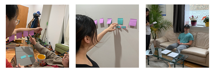
This usability focus on user’s behavior when interacting with 3D objects and 3D button outside of 2D screens so I made a very rough sticky notes A/B test both have sitting and standing situations. Different colors of the notes stand for different statuses of the objects. During the test, I introduced the changes while they making actions, and let them use “think aloud” to speak out what they except, assume, and the exhaustion of their arms.
“When doing the task in a limited space, and especially when the task is easy enough, no need many flexible fingers actions, the single hand can deal with it.”
— Zixuan
- 1 of them mentioned in different situations, the design should be different. For example, she preferred having a control plane including buttons and confirmation warnings while standing, because holding a cup forces her to look down.
- All of them said the buttons that come next to the touched drink are intuitive and they hope it could be faster to do the next step.
- 2 mentioned that because it is in the real world situation with real objects, they can have a sense of distance. But if they were digital, they didn’t know how far should their hands reach.
I noticed for zero VR experienced person, she touched sticky notes very carefully at the first time. But after I told her the alpha of the box concept, she understood that and tried to use her entire hand to touch the bigger objects. Also, they performed very chillily with exaggerated arm movements, especially when touching bigger objects. They didn’t like to return their arms so frequently. But when came to interact with small buttons, their hand movements became carefully but flexible.
All in all, here are the insights from the test.
- The following actions should appear near the touched objects when all of them are in a comfortable position for users;
- Users still prefer a relatively 2D “plane” to do tasks, mostly in this case is XY plane, also they want faster and more convenient ways to interact.
- The visual proximate effect is also good for users to understand the space.
Design Experiment
I break down the entire process to analyze How Might We improve this simple interaction.
Referring to the xyz-coordinate system so that can tell the efforts that users use in each step. The red ones mean “big” efforts, the black ones are tiny efforts. Because the user doesn’t like using energy along Z-axis (forward and backward), I proposed a Single Layer concept. The new steps list on the right side.

Fun fact is that: in computer language, we have OnMouseMove (move), OnMouseIn (hover), OnMouseDown, OnMouseUp (usually these two together represent select or click), and OnMouseLeave( which usually be used for “un-do” combined with OnMouseDown when leaving the clickable ). So when the hand leaves the area from buttons, which means the button pressed. If the hand goes back to the main drink body, the buttons will also disappear, which means not pressed.
Demonstrations
1. Touche effect
When the hand touch the drink area, the box will pop up, with the hand goes deeper, the box will become more visible and the new buttons will pop up in the bottom.
2. Select effect
Once the hand goes into the button area, the button will be selected, you can unselect it anytime by moving hand out of that place. It’s like hovering on that. Going out of that button, out of the entire drink area means you clicked the button.
If selecting “Gift”, there will pop up another deeper menu options with the same logic.
3. HandMenu
Same as the current menu trends in VR, I put a button in the palm side. when user forms a fist, the menu will slide out. With the same “Single Layer” concept, user can directly move his fist to the menu contents on the right side to highlight the button he wants. And then, the logic of making selection is as easy as deleting an App in iPhone — releasing the fist to let buttons selected. My intention is to decrease users’ “reaching objects” effort in real world. Meanwhile, this kind of gesture is a way of providing physical feedback, allowing user to understand they are selected something.

4. Considering the Misoperation
Because “Grab” gesture is easy to make, user may make some mistakes unintently. So in order to open the menu correctly, I added the “Release” gesture before “Grab”, which means, only when a clear “Release” has been detected, the “Grab” can be triggered propoly.
I made another version in C4D— “Pinch” to operate the hand menu, inspired by the interaction in Oculus. When user start to do Pinch, there is a tiny animation to show the cursor is been pressed. Plus my “Single Layer” concept, use can select the content very easily.
Reflection
Designing Mixed reality without Hololens is pretty hard, but with the help of Manomotion, I can access my hand data in real time AR simply by my iPhone. The previous code knowledge is helpful for me to start Unity development, working with C#, to build the meaningful interaction design pieces.
As an UX designer, I used to work on the interfaces for smartphones, exploring what kinds of interaction could benefit users in the 2D screen. But when comes to 3D spatial design, things got tough and strange. I always hold the opinion that the interaction mode in 3D shouldn’t simply copying human’s nature movement and place several 2D floating screens in that space. Therefore, after I experienced several cases with hand input, I proposed the “Single Layer” concept to help users’ lives easier in MR.
In the future, I will focus on more visual effect to help design the transition in each steps more clearly, bridging the missing part of the sense of feedback feelings.
